A Better-Looking Website That Still Scores 100 on Mobile
I wanted my website to have more character. My old WordPress site used an American flag theme, and the plain new version I’d rebuilt was fast but didn’t feel like mine yet.
So the question was: how do I make a website look better without slowing it down? I treated speed as the limit, not something to win back after the design was done. Every visual extra had to earn its place.
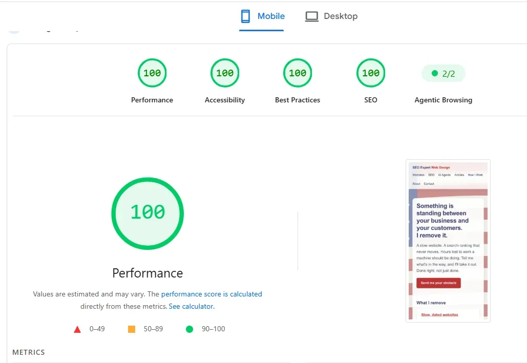
The mobile test after the redesign
On November 19, 2026, I ran the redesigned seoexpertwebdesign.com through Google PageSpeed Insights on mobile. It scored 100 for Performance, Accessibility, Best Practices, and SEO.
PageSpeed Insights is Google’s testing tool for a page on mobile or desktop. Its lab section uses Lighthouse to analyze a page in a simulated environment. That makes the result useful, but it doesn’t make it a guarantee.
A lab result is one simulated test on one device and one set of network conditions. Scores can vary between runs because conditions vary. Field data is different: it comes from real visits across actual devices, networks, and locations. Google’s guide to lab and field data says the two measure different things, and field data is the better guide for priorities when it is available.
So I take the four 100s as evidence that the redesign stayed lean under that test. I don’t treat them as proof that every visitor will have an identical experience.
What I added to the design
The most visible change is a faded, waving American flag behind the page. It brings the old theme back without making the site look like a flag pasted behind some text.
I also added frosted “glass” panels, a header that stays at the top on larger screens, and an illustrated thumbnail for every article. Together, those changes give the site more depth, color, and identity.
None of those ideas is unusual. What matters is how they’re built. A design feature can look small while hiding a large image, a script, or an effect that keeps asking the phone to do more work. I chose versions that created the look with almost no extra cost.
The flag is code, not a large photo
The flag is an SVG, which means it is drawn from code as shapes rather than stored as a conventional photo. It transfers at 4.8 KB compressed, and the browser can cache it for a year after the first visit.
It doesn’t move. The waves are part of the drawing, not an animation, so the flag adds no continuing motion while someone scrolls. It also sits on its own fixed layer. I didn’t use the CSS “fixed background” effect that can make scrolling stutter.
I considered a moving video flag. I rejected it because a video loop typically adds half a megabyte to a few megabytes, and it keeps the phone’s processor busy for as long as the page is open. I also rejected a photo background. It would be heavier, and a large background image can become the largest item Google times for loading. Google’s definition of Largest Contentful Paint includes elements with a background image loaded through CSS.
The coded flag gives me the character I wanted without turning the background into the main download.
The panels look blurred, but most aren’t
Real background blur appears only on the small header. The CSS property called backdrop-filter applies effects such as blur to the pixels painted behind an element.
I didn’t put that effect across the large article cards or content panels. Large blurred areas make the browser redo the blur as the page scrolls, which a cheap phone can feel. Instead, those panels imitate glass with semi-transparent white, a light border, and a soft shadow. That combination gets most of the appearance without the continuing work.
The text panels are about 94% opaque. The flag still shows around them and slightly through them, but the words keep strong contrast. Decoration stays behind the reading rather than competing with it.
The article images are tiny and load in stages
Every article now has an illustration. At the displayed size, each WebP image is about 1 KB, with files ranging from 0.6 to 1.4 KB. WebP is the image format used here to keep those thumbnails small.
Each image also has its width and height written into the page. That gives the browser space to reserve before the file arrives, which helps prevent the page from jumping. The browser-level image lazy-loading guide recommends width and height attributes to avoid disruptive layout shifts.
The first two thumbnails load immediately because they appear near the top. The rest use lazy loading, which means the browser waits until someone scrolls near them. The same guide recommends normal eager loading for images in the first view and lazy loading for images outside it.
“Add images” doesn’t have to mean “download every image before the visitor can use the page.”
The remaining improvements have almost no weight
The header stays visible on larger screens through one line of CSS. It requires no image, library, or download.
Headings use text-wrap: balance, a CSS setting that distributes words more evenly across short lines. MDN’s text-wrap reference says the setting improves layout and legibility for short text such as headings, with negligible performance impact.
There’s no JavaScript on the page except the data that describes the site to search engines. The CSS is built into the page, so the browser doesn’t wait for a separate stylesheet file. Compressed, the home page itself transfers 3.6 KB and the Articles page 4.7 KB. Add the 4.8 KB flag and about 1 KB per thumbnail, and you have the whole visit.
Those totals matter more to me than whether an effect sounds modern. The complete page is what your visitor has to wait for.
Questions to ask before approving a visual extra
A business owner shouldn’t have to choose between a site that looks credible and one that loads quickly. But every visual extra has a cost, even if that cost is small. Someone should measure it before the feature goes live.
When your web person suggests a background, animation, slider, video, or visual effect, ask:
- What does this add in kilobytes to the first page load?
- Does it move or animate after the page appears?
- Does it require JavaScript to run?
- What happens when I try it on an inexpensive phone over a normal mobile connection?
These questions don’t ban design. They make the tradeoff visible. If an effect adds real value, its cost may be justified. If it is only there because a template included it, the visitor shouldn’t have to pay for it with time and battery.
A fair note about the four 100s
My site is small and static. Static means its finished pages are created in advance instead of being assembled from a database for each visit. I built it with Astro, and that makes a perfect lab score easier than it would be on a large store with accounts, inventory, payments, and many third-party tools.
A WordPress site with several plugins has a different ceiling. It can still become much faster, but the right target depends on what the site must do and how much machinery it carries. If that is your situation, I wrote a separate guide to deciding whether to fix a slow WordPress site or rebuild it.
The useful lesson isn’t that every site must score 100. It is that better-looking doesn’t have to mean heavier. Start with performance, add character carefully, and test the complete result rather than trusting the appearance alone.
Tell me what bothers you about your site
Send me your website and describe what feels wrong. It may be slow, dated, hard to read, too generic, or all four. I’ll look at it and tell you in writing what I’d change, without loading your pages with effects they don’t need.